D for Defense #25

(Previously on DfD…)

(by Mr Multiplexor)

HAs you can see this is a clear example of how anyone can think superficially and not understand the intentionality of work of the artist.

Let’s first hear what their points are about ROB!’s image and afterwards we will refute them.

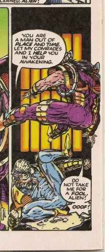
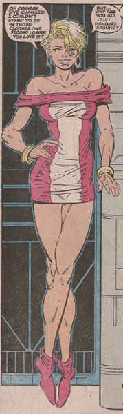
>Oh, those pesky feet.  Those pesky, tiny feet.

>First of all, Cable’s hips and thighs are comically wider than his upper body.


The detractor is complaining about two of the most common qualities in ROB!’s art. First, the tiny feet, second, hips that are bigger than the superior body. As any of our regular readers will know ROB! doesn’t let anything to chance and if these two caracteristics appear in such an evident manner is to transmit a message. Afterwards I will explain these reasons, but let’s finish before the analysis and view what conclusions our critic extracted from them.

>Secondly, he obviously drew that gun in after he drew the whole rest of Cable.  Cable’s fist is sort of nebulously hovering outside of the area where I guess the hand would GO if that were an actual gun, but he isn’t actually holding it.


Now he complains about the disapearance of Cable’s hands. A complaint that would be legitimate if we didn’t blindly trust on ROB!’s artistic

skills.

>It’s just kind of tucked under his arm as though he were taking a gigantic newspaper to the john.  And where’s his other hand for Christ’s sake?


I agree that the gun looks out of place and it seems to have been added after the picture was completed. I am not going to refute it but I will explain the powerfull reasons behind this strange decision.

>I think everyone needs to realize that Rob Liefeld was THE MOST POPULAR COMIC BOOK ARTIST IN THE WORLD at the time.  His comics sold millions of copies.  He starred in a Levi’s commercial that was ABOUT HIM.  AND THIS IS WHAT HIS ART LOOKED LIKE.  HE MADE MILLIONS AND MILLIONS OF DOLLARS FROM THIS YOU GUYS


In this last paragraph, as if their enmity against ROB! wasn’t clear enough, the critic in capital letters, simulating shouts of shock, he reproaches to ROB! his success. Jelousy is always bad company.

But let’s not get distracted of the goal of this post. Before explaining the tricks behind the Masterpiece let’s look at it again and analyze the action that is happening in it…

Cable is saying "Once we enter in the battlefield, you are on your own". And at his side, if the critic hadn’t viciously mutilated the Masterpiece, we would have seen the faces of his "soldiers". For those that haven’t had the benefit of reading the last arc of New Mutants and first of X-Force I will explain that they were full of simbolism, the New Mutants had always been a group of kids whose tutelage had gone from Xavier to Storm to Magneto in a erratic way
that made them some kind of eternal orphans.

It all changed with Cable’s appeareance, who took them under his care and started preparing them for the real world.

In a way, it could be said that Cable was the stability that they had ever had, simbolizing the first motherly figure for the New Mutants. This is the exact point that the people at Progressive Boing have missed because as any Art student could say the first figure found simbolizing motherhood is a tiny clay sculture called "Willendorf’s Venus"
.

venusita.jpg 

Wide hips, small feet (some would say inexistent) and hands that dissapear…

Yes, I think it’s quite clear that anyone can see GENIOUS! and not understand it, but they are harming no one but themselves with their ignorance. It’s way worse when in their arrogance they think they can teach lessons to everyone.

Study art history, little boys. That way you will understand better ROB!’s work.

Some would argue that my thesis doesn’t explain the presence of the gun that had been added afterwards. But it’s safe to deduce that ROB!, in his eternal wisdom and knowing that his detractors would no doubt try to disgrace him, decided to corrupt the purity of his metaphor and introduce an element that guided the less iluminated.

The gun is used highlight Cable’s protective mother function over his offspring /soldiers. It tries to say that underneath that strong exterior Nathan Dayspring is only a mother worried over what could happen to his kids in the battlefield.

So that’s all, I hope that from now on, everytime you see an image of Cable holding a disproportionate machine gun you remember this humble explanaition and remember your own mother.

(Additional Comment by Ender.)

My most known scolars in Art Anthropology say that after a rigurous study of four years and a huge doctoral thesis he has concluded that Willendorf’s Venus and all look alike statuettes are really contraceptive methods


(Be here next week for this:

24.jpg

)

D for Defense #27

(Previously on DfD…)

(by Kiko)

I have been told that there are people that don’t share our faith, that don’t believe in ROB! They even allow themselves to criticize his Capitan America.

Heretics! Infidels! You need to be shown which is the true greatness of ROB!, and for that we are going to carefully study an awesome image of his Capitan America:

capi1.jpg

NNooooo, this one has already been seen too much, we all know those two "powerfull reasons" to follow Capitan America’s book at that precise moment, but now we need go back a little more and study ROB!’s Capitan America before he got his uniform:
 

capi2.jpg


Weeeeell… This isn’t the image either! I said before getting his uniform! I didn’t mean I wanted to see him out of it! Allow me a moment and I will get the image by myself…

Now! Finally!

This is the image I was refering to, where you can also see the greatness of ROB!. If we take a look, which is the first thing that comes to mind?

Efectively, teeth! Both Nick Fury and Steve Rogers wear a huge and impecable denture worthy of the best Colgate models. They are so perfect that they look exactly the same, as it also does the set from the women’s mask.

Because they are american teeth in perfect american faces. That is why they look alike, this is their real face! This way ROB! represents the face of all unkown american soldiers. Aren’t they all the same under the law in their Country? Aren’t they all the same under their flag? This is our ROB!, an american patriot!

Even Red Skull has a great white set of teeth! Because, can’t you also find a little of good and pureness in any villain? This is ROB!’s way of telling us that Red Skull is not the typical Nazi flat villain and he has some depth underneath him.

Now we can focus in the most GENIUS! part of this cover, in the "piece of resistance". I am refering, of course, to the AWESOME! drawing of Steve Rogers.

Do you think that Steve Rogers would need to prescind of his neck to adopt that pose? You’re right! He is ROB!’s Capitan America, he always holds his head high. Always! And if he needs to new articulations in his non existent neck to maintain his thundering look into the skies, he just creates them! That’s the  reason Steve Rogers is a supersoldier and we are not.

Look now at his legs and feet, well, foot; the other one has misteriously becomed invisible (I am sure it’s part of a Red Skull’s plan). Is it posible to maintain that pose? How can a man this big have such small feet (well, small foot)? Wrong again! This is what the soldier super-serum is for. Haven’t we seen Capitan America jumping and doing imposible stunts while fighting in mid air? Which other colective jumps and does imposible stunts in the air? Exactly, the
dancers. That is why ROB! represents Steve Rogers with these small dancer’s feet. ROB! knows that the summit of human perfection must be something between a ballet dancer and a young Arnold Swazeneger.

If you don’t think alike look at those HUGE arms that ROB! has drawn. That’s how you represent Capitan America, with huge arms capable of reaching out and embrace everything, as his beloved USA.

Finally, let’s focus on something very important for Capitan America, his shield. In this image it was a weird shape, slightly twisted, you could even say that is dented.

But we know that nothing is accidental and in ROB!’s art everything has it’s meaning. Look at the drawing again. Have you realized? That’s right, this is a Steve Roger’s drawing, not Capitan America. That is why his shield looks deformed and dented, with this ROB! is telling us that Steve Rogers can fight but he is not fully ready, he is still not Capitan America… Don’t tell me you haven’t seen?

HE DOESN’T HAVE TITS!


(Be here next week for this:

26.jpg )


D for Defense #28

(Previously on DfD…)

(by Isaac Hernández)

I was asked to defend this image from one of ROB!’s comics and I must confess I have never in my life been in such a pickle. Defend? What should I defend? Is there anything strange in this image? I sincerely don’t see it.

I have been told that the folks who hide in the Progressive Boink blog think that the image has some kind of perspective problem that puts the two characters in different planes unable to hit each other. However, as we explained in other occasion, ROB! is the greatest artist of all time, he broke old concepts like classic perspective and tries to teach modern artists new paths to tread.

Only someone with no artistic culture would confuse ROB!’s brave use of perspective with an error, with only one drawing he tries to emphasize actions and feelings. Two fighters, two different positions in a masterfull way of demonstrating that as much Prophet and Combat fight none of them will never persuade or impose their ideas on the other. These degrees of separation that place them so near and so far at the same time are a brave allegation against violence on an author that has sometimes unfairly being acused of having a pro-belicist point of view.

Not satisfied with uncovering to the internet community their blindness, the boys from Progressive Boink also make a fool of themselves when they say that he dialog in the piece is too long for the action represented. As if a time traveler and an alien had to be subjected to the verbal limitations of a normal human being. You have to be childish to think like that!!

(Be here next week for this:
27.jpg
)

D for Defense #30

(Previously on DfD…)

(by Bac Hylon)
 
Documented history shows us, yet again, how Rob Liefeld’s work can be found it’s deserved place in Comic History, not only because of it’s artistic value but also because of the educational and moral values it transmits.

In this ocasion we focus on Chapel character, mercenary and founder of the YoungBlood team, being his methods more than questionable and his behaving borderline inmoral. You may wonder what are the values that ROB! is trasmitting to the effervescent minds of young readers using a character like this one but I think it’s a very clear message. Chapel acts as an example. An example that he wants children to avoid. ROB! leaves it very clear "Kids, don’t be like Chapel, he isn’t a good guy. You may find him cool at the begining but remember he was the one who killed Al Simmons, which ended up creating Spawn. If it wasn’t for him Spawn would have never existed, is that the example that you want to follow with your life?"

This way ROB shows that even when he is not fighting and killing enemies, Chapel has a reprobable behaviour, also ROB tries to give young people an example of how things shouldn’t be done. He does it with only three little pannels that don’t even add up to a page. ROB! has always been known for an efficient and ecologic use of means.

The scene starts using a text that places us space and time wise. At 1:11PM, to be exact. Notheless Chapel wakes up thinking it is still night. Isn’t it obvious? He is just a lazy who uses up every moment he can to burry himself between the sheets, instead of rising up early and doing something usefull. The man we are watching behaves like a bum and a slaker, who even boasts of taking advantage of the fairer sex. Kids, do you like this demeanor? Do you want to end up like him?

Not only that but as you can see in the second pannel, he has infected his girl with his laziness, she grumbles that she wants to stay slaking a little longer. Which is Chapel’s response? Turning off the alarm clock (it rings again in the third pannel), because as we can deduce from Chapel’s sitting position in the bed, between the third and the last pannel there is a time lapse of five minutes, usually the time for the snooze alarm to ring again.

Just another example of Chapel’s reprobable behaviour. His only way of being more insultant would be saying "And fetch me breakfast before going, babe". What would a feminist role model say? Who could posibly want this person as a role model? Won’t somebody PLEASE think of the children!

ROB! himself would give us the answer to some of these questions in the YoungBlood comic, when the character would end up finding his demise, showing us the terrible consequences of Chapel’s lax and inmoral life. Only the champions of youth like ROB! know well that it’s equally important to show heroic figures that the kids can identify with and examples of what are the consequences of flirtling with the "Dark Side".

ROB!’s work is full of teachings for any who wish to find them. So please remember my words every time you enjoy one of Rob Liefeld’s comic.


(additional defense by Xum)
 
 
Even though I share all the points raised by Bac Hylon I must raise a few more for your consideration. Yes, for the inexperienced eye it may seem I say the oposite of my dear collegue Hylon, but that is why ROB!’s art is so AWESOME!, it allows multiple interpretations (some of them completely opposite) and ALL of them are RIGHT.

This is the greatness of ROB!.

As we have been doing for some weeks I will now proceed to clean the honour of our loved spiritual leader from the falacies those jelous group of critics from Progressive Boing are spreading.

Most of the complaints about this image come from the alleged chauvinist and retrograde attitude of the main character, the superheroe/soldier created by ROB! and called "Chapel". The problem is, as always, that the critic just looks at the surface and, without understanding the different layers that compose his personality, decide to condemn him.

From a first reading we can extract some data: this man is a true soldier, loyal to his Country and available 24/7 for the YoungBlood programme. There is not an issue too personal or important that he doesn’t leave aside when he is requested by his Country ("El deber me llama cariño"). In second place we can also see that he is a very direct person, without duplicity, he clearly indicates the women that he has shared the night with that this is his way of life, that he has no place for compromise as he has already choosen the path for his life.

Chapel doesn’t lie to anyone, "Sin promesas (No promises)" he tells her.

But that is just the tip of the iceberg of his characterization, the first of many other layers of information that ROB! has built. The true Chapel, his true feelings and sensitive side we can easily deduce them using a series of clues skillfully hidden. Chapel, not only loyal but also has a tender soul that we can see in the smallest details.

"Otra noche, otro amor" Chapel thinks while, as the critic from Progressive Boink shows, it’s 1:11PM. This evil guy says in his analysis that this is an error, but we know better than to doubt ROB!, in his work nothing is wrong and anything that may sound that way is part of a hidden message.

Knowing that little data anyone can reach the only posible conclusion: Chapel not only has spent the night with this lady but also has been paciently waiting for her to wake up (probably more than six hours), that’s the key to understanding a character as complex as Chapel.

Can you call chauvinist a man who waits during hours so that his couple catches a few hours of sleep? No! In the image we can see how she uses his body as a pillow, does he complain? NO! How many of us, lesser men than the ones ROB! draws, would use any excuse to run away in this situation? Not Chapel, as shown in the first reading he is LOYAL, capable of waiting for you during hours until you wake up. We can even extract from the first drawing that he hasn’t used the oportunity to get some sleep himself, NO!, that is not his style, he waits paciently as his woman rests.

Chapel would gladly spend whole days awake, waiting, to give a resting place to any of us. With only one exception (and here we link with the basic premise of the character) and that would be if it came into conflict with his one and only love: his Country.

For this ideal he is capable of sacrificing anything, kills anyone or even wakes up any lady that may have been resting on top of him.

This spirit of sacrifice can be clearly seen when he asks for hernumber, telling her that although he is interested his loyalties always lay with his country. Anyone other person might have lied to her but Chapel respects this woman too much to do this to her.

This is Chapel: loyal,
noble and compromised with his ideals.

A true creation from ROB!


(Be here next week for this:

29.jpg
)

D for Defense #31

(Previously on DfD…)

31.jpg
(by J Calduch)

The uselessness of the people from Progressive Boink reaches the point where they mock a drawing that it isn’t even kept any longer in their server, in it’s place we can only see a little black square, which would explain our troubles finding someone to defend it. Without wanting to create a precendent it’s going to be me, the one signing who is also going to do the Defense this week. No problem, it’s a great service, even a pleasure, to defend these images. I kept a copy of the image from when they published their text circa 2007, un a folder, well preserved, just in case that one day… And that day just arrived. 4th of March, I can feel thousands of expectant surfers at the other side of the screen. Here we go!

Let’s see, in the image ROB! is introducing a new character that will gain in importance during his period at X-Force, although when Liefeld left the book the following artists didn’t know how to handle him correctly and he fell into oblivion. G. W. Bridge, a powerfull name for a S.H.I.E.L.D executive. It’s the first time we see him so the artist is going to show us the basics of the character so that in just a look of this image we can know all his key aspects.

A uniform. We see technology, we see armament, we see belts, the essence of what the counter espionage agency S.H.I.E.L.D was during the 90s. And the one wearing this cool outfit is precisely G.W. Bridge. A great character. Really great. We can see how great he is comparing him to the character at his side, with the ship in the background  and especially with those little men burning the associate’s leg. A real gigant. At the very least as his namesake George Washington bridge.

The bonfire is clearly an unsolved reference to the movie "The Wicker Man", the 1973 version which latter (in 2006) would be remaked by the comicbook fanatic Nicholas Cage. We don’t have to spell out that the result was an AWESOME! remake, as it happens with everything that is remotely related with ROB! even if it is this obliquely manner. We can’t even rule out that this image was a reference (using tachyons) to the remake. Nothing is imposible for HIM!.


peliculas.7371.IMAGEN1.jpg

This sensation gets confirmed when you realize that by assuming that the associate is really a "straw man" like the one in the movie, you can then coherently explain the lumpy texture of his uniform (like he recently arrived from one of those japanese parties). The "straw man" expresion has probably an important meaning in the espionage jargon but Nicieza didn’t want to delve any further in these suggestive aspects. It probably happened as with many others that only managed to see there a cast character whose only use was to reply to Bridge. The potential was there, you just needed to see it and use it.

But let’s get back to the defense, we were still arguing that G.W. Bridge is a great character, huge. In fact, he is so huge that his image has several sets of vanishing lines. As we focus on them, we can see they make atention of the viewer converge in a single point of Bridge’s internal horizon as he is SO huge he has his own vanishing point. That point is in his… Well, let’s asume you can also see it.

The Family Jewels. The Master of Ceremonies. The General with two Colonels. G.W.Bridge is great, strong, a soldier. And especially he has B*LLS. One look at the image and you involuntary focus there, wonders of perspective. He is a character with B*LLS. A big boss from S.H.I.E.L.D. with a cool 90s uniform and b*lls. G.W. Bridge has b*lls, and we know it from his very first appearance, an impresive demonstration of character that shows Liefeld’s skill to convey feelings through dinamic statism, a technique that makes even the most paused scenes trasmit testosterone and manhood. In just a single word: b*lls. What a difference with the static dinamism from other modern "artists" whose action scenes just make you yawn.

Now I would like you to imagine any other awesome character, but that it wasn’t created by ROB!, and track down his very first appearance, this way you will see better the merit of this presentation that we have just been studying.  Whomever said that comparisons are hatefull is the one who doesn’t end up well when they are made. [Yo suprimiria esta frase]

Leaving aside all these facts and entering the domains of especulation I have my own theory about G.W. Bridge. The character, created in 1991, has gray hair like Bill Clinton, president of the United States from 1993 until 2001. Not only that but he is called G.W. as G.W. Bush who followed him in the presidency from 2001 until 2008. They were succeeded by Barack Obama who is african-american, like G.W. Bridge! Could it be posible that through this character, named as the first president of the United States, ROB! was predicting the next presidents of his country? We will end up knowing as the future becomes the present. So when the next person who sits on the presidential seat has a goatie or wears his trousers up his belly remember that HE! already told us. And believe a little more.

(Be here next week for this:

30.jpg
)

D for Defense #32

(Previously on DfD…)

(by Dan J. "Herbie")

After our fair defense of ROB! from the repeated attacks of Progressive Boink we find ourselves again in front of a new example. These "people" (we can’t find any other noun to define them) accuse master ROB! of filling his master pieces with Character’s faces that are full of lines. Yes. Characters with a first capital letter, it’s their right as ROB!’s creations. Continuing with the criticism, it jokes that these lines make any Character older, and in over beloved Shaft it would make him around 900 years old. Heretics! Don’t they know that the glorious ROB!’s will handles, twist and improves the continuum of space and time?

ROB! is beyond the past, further than the future and who knows where in the present. His work is equally appreciated and admired throughout the eons. The lines that we mentioned before are variation from different pictorical times that are still yet to come and that HE is their Prophet.

Also, these thugs from Progressive Boink dare to doubt the illumination in the image. How can’t they see they are before a master piece? The illumination comes from the Sun, from a lamp or a passing car… But furthermore, it comes from ROB!’s eyes when he looks at the paper, illuminating Shaft’s hair and giving it a life of it’s own that would be impossible to do for any other artist.


(Be here next week for this:

31.jpg

)

D for Defense #34

(Previously on DfD…)

As an strict investigator of art movements thoughout history, Mr. Liefeld translates his genious in these two pannels. Not only is it a homage but a composite outline in deconstruction and reconstruction of Modernism and erotic narrative of final 19th and beginings of 20th Century. All that without leaving the usual pop art schemas usual in superheroe comic books.

Modernist guidelines are present and deconstructed. From the presentation frame (an awesome stablishing shot where the mountain crowns the bath tub, the interior / exterior shown as an integrated whole) to the scrollwork also very present in modernism (see the affiches in Mucha and Casas, for example), that brilliantly take here the form of a ethereal smoke, vaporous, like an ambiguous gauze that conforms a sensual ambient.

Also, the zenith drawing of the bath tub not only meets the objective of framing the pannel into a narrative time but it also becomes compositive part, integrating itself in this great pannel. The wood
surrounds the environment, giving it an organic plasticity while it also pays homage to the images we talked about before.

The main characters in the image operate in a misleading sexual manner, with a sensual view halfway between art and the erotic narative that the author has researched in the making of this pannel. The woman seems to rush into the experience, opening her thighs, while the man receives her with his erect knee in a clear sexual metaphor. What in other scope may be a simple image where two characters relax in a tub, in Liefeld’s hands becomes an erotic game, ambigous, with
several layers of meaning.

Mr Liefled plays with the approach, with the deliverate deceit, with the subtle metaphor that manifests his genious.

Progressive Boink’s critism has no substance or fundament. It’s based in personal opinion, pointing the deformity of the characters without going deeper into the authors proposal. I would assume that the same critics in front of a Greco painting would comment: "Oh, those characters are stretched".


(Be here next week for this:

33.jpg

)

D for Defense #35

(Previously on DfD…)


The prolific imagination of Rob Liefeld when creating new characters is only comparable to those of great creators like Jack Kirby or Steve Ditko. This is how he was capable of renewing the New Mutants villain rooster with an incredible ease, creating out of nothing a large series of very charismatic villains, so dificult to handle that later authors didn’t have any other option than relegating them to limbo when they saw themselves incapable of reaching Liefeld’s freshness in
development of new and attractive characters.

One of them was Forearm, an original villain also in the little game with his name, as his mutation consists in having four arms.

The boys at Progressive Boink say that Forearm has no depth or interest, but everyone knows that an artist is greater by what he shows between the lines than by what he tells directly. We know that a person with four arms is a freak, a deformed, imagine how harsh his childhood must have been, let’s not even consider his adolescence. This kind of marginalization can only lead to joining a mutant terrorist group. Forearm is just a victim of his circunstances, but Liefeld doesn’t explain in detail something that he knows should be clear for his watchfull followers when he can better serve us by focusing on the action.

Also in Progressive Boink they insist in looking for a logic in Forearm’s anatomy. As if people with for superior limbs were common in medicine or biology books. Liefeld represents the deformity in all
it’s rawness, transmitting the horror of living trapped in that body so far away from usual beauty cannons. Luckily nowadays Marvel writers have felt pity for Forearm and he has lost his mutation after M Day, giving him the oportunity of living a normal life at last.

(Be here next week for this:.

34.jpg

)

D for Defense #36

Boy can old Rob design a costume!  Let’s see, half-jacket, turtleneck, matching dance troupe gloves and oh yes GIGANTIC AREA.  Apparently the background artist for this panel was Harold, who was kind enough to lend his magic crayon to the scene.  Hey, no feet in this one!  Score!  Oops, still managed to fuck up Deadpool’s hand pretty bad, though.  Oh well, I’m sure too many people will be unable to tear their eyes from that bulging gray package to give a shit.

Let’s start by saying that ROB! is, among other things, a Cool Hunter and a trend creator. His risky and innovative designs may scare those that prefer the old spandex look but ROB! has always been unique and managed to give his clothes a unique personal brand.
 

ROB! in this design conveys that this character is in fashion as he has carefully combines both colours and complements:

On one hand his red blazer (tipical of the time) combines with his gloves and, probably, with his boots. On the other hand, the marks on the jacket in a metalic grey tone is the same as the collar, arms and belt pocket in his leg.

We must admit that the character’s crotch is notably highlighted. But seeing Deadpool’s pose and seeing that he has a "light hand" (pun intended) we prefer to assume it’s just the heat of the moment and not an error of our defended.


(additional defense by Myca Vykos)

We all know that ROB! rules. That he is a fucking genious of the drawing pen is public domain. But what most of the populace may not know is that ROB! is one of the greatest fighters for freedom of speech and censorship in comic books.

ROB!’s ideas have always been clear. You can’t limit art. And the rigid Marvel was not the best place to express freely, that’s the main reason he funded Image (not like that greedy TODD!, we all know he did it exclusively for the dough). In Marvel ROB! wanted to make more adult stories but Bob Harras wouldn’t go with it. Time always puts everyone on it’s place and Bob ended up in Wildstorm, under JIM! Lee’s orders.

But during his ternure in Marvel ROB!, as any other GENIOUS, would still camouflage his art to draw whatever he wanted. And if he felt like drawing bizare sex, he would have it, independent of what his bosses wanted.

36.jpg

A superficial view of the image makes you think that Garrison Kane is a cyborg that has launched his left hand towards Deadpool’s neck. But that is not the case. If there’s something that ROB! masters it’s kinetic lines. Let’s clean the image and see where the hand comes and where is it heading.


Limpieza.JPG
There it is. The hand comes from the center top and goes to the center bottom. Think of where this hand has left and where it’s heading. How can a fist come from "there"? Of course. Haven’t you seen Kane’s scrotch? Why should there be any limits in cyborgs design? 

Yes, gentlemen. The dialogs may say whatever they want but this pannel shows clearly what the sexual practices between members of the Weapon-X Project are. Cyberfisting, gentlemen. Top this if you can.

(And for those wondering where Kane’s right hand is there is an easy answer: it’s taking a beer with his right foot)


(Be here next week for this:
35.jpg
)

D for Defense #37

(by Uriondo)
 

The image that we are sharing tonight is, like any other from this author, a composition prodigy that not always is valued like such by certain bigoted critics. "Why does Rob Liefeld think that guns should have two holes?" argue opponents of Rob!’s work. It’s very simple, smartass. Because it makes MORE sense!

I still remember, years ago, when it was mandatory the use of one rearview mirror in cars. The other one was optional. "Why the hell would anyone want a second one?" was the thought shared by all of us not touched by innovation.

Otto Octavius thought that two arms were not enought, and no one discussed Stan Lee’s mastery over anatomy. Of course he knew that normal people only have two arms. But extraordinary people have the right of choosing as many arms as they feel like.

In fact, unbelievers can now see how USA’s weapon industry has learnt Rob!’s lessons.

They also complaint against the yellow background and the ilumination. Why are these characters confronting their enemy with a yellow background and an intense zenithal light? And it’s here where we find the allegorical that puts Rob! above the average artists. The yellow colour simbolizes in english fear, while in spanish it’s more common to use it as a symbol of bad luck. The critics having underestimated Rob!’s talent only consider (if so) the first meaning while our artist focuses more on it’s second. Rob! is not afraid of bad luck and reminds us that he was brave enought to create his own company. If we counterpose this yellow background with the clear red present in the

clothes of the characters we find a dynamism very infrequent nowadays. It’s easy to enfatize a bright colour over black and white as  Frank Miller o Spielberg do. But doing it in the 90s? Boy, that wasn’t easy at all.

Last but not least, we must highlight the wordplay made by using our character’s names.

BloodShoot

DeathMate

YoungBlood

Blood4You

It’s here where Rob! shows his love for literacy. Not everyone would know how to make an alliteration like him. It reminds the refreshness of a fresh drink (blobloblo). It’s a young and vibrant sound to win over youth.

And with that I rinse my tears of admiration and say goodbye for today, friends of Rob!’s work.


(Be here next week for this:

)