
Q: "Another aspect of your work we admire, besides your role as an Architect, is that of a designer. To be more precise, we immediately fell in love with the intringuing logo for the upcoming New Avengers series. Tell us more about it. What are the reasons behind this design? we think it is very suggestive"

Hickman: "Nice, isn’t it? I think it comprises an complete story in itself, although my long-term plan is to tell the entire tale in a slow pace in my two Avengers series and maybe some limited series and one-shot specials. Four of five years is a reasonable timing to report all these events that are boiling in my head. I have a big head."
"I take the design work very seriously. After all, I am an artist. And the concept of Art, in a Renaissance way, encompasses a sinergy of disciplines that go further beyond merely writing or drawing. I am talking about transmission of ideas through the dispossition of subtle bits of information here and there, and when you have a look at the big panel you realize that all clues are present since the very beginning. For this reason, this logo is one of the most important messages I have ever transmitted to my expecting fandom. The first thing you see when a new comic arrives is the cover. And the first thing you see in the cover, apart form the generic shot of posing heroes, is the logo. A mediocre logo can throw your entire career out. This is the reason why I focused most of my creative energy on the graphic concept of this design, considering it my biggest challenge to date."
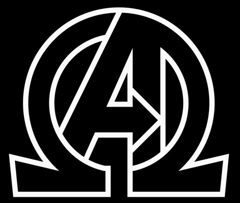
"I combined the iconic A of the Avengers team with the greek letter Omega, so in a single and powerful design you have the Alpha and the Omega, the Beginning and the End, the Ying and the Yang, the Good and the Bad, the Order and the Chaos. The entire existence is condensed in this image. Not bad, sometimes I still think we should charge buyers an extra buck each time they buy the title, or even each time they look at the logo."
"After this explanation, it would seem that my work was finished, but this logo does not represent a static group, the characters and the story are moving, constantly evolving. So the arrow pointing to the right adds the feeling of movement. This will be a dynamic story that will go to everywhere and everywhen with everybody who is, has been, or will be an Avenger."
"The concept of Illuminati (a greek word, I think, and omega is also a greek letter, got it?) is so powerful that sometimes I can not believe that it was other than me who invented it. Playing with them one can tell stories about conspirations, symbolism, and these things with circles and diagrams I like to do and my public also adores. This logo is the constant reminder that New Avengers will be the Danbrownesque title with the Hickman touch on it. I would say that this design is the best work of my career, but I am sure that in a short time I will come up with something even greater, so…just wait!. It is so hard being a genius…"
(Traducción libre)
P: "El logo de Los Nuevos Vengadores ¿lo has hecho tú? y de ser así ¿significa algo?"
Hickman: "Veréis, esto va de los Illuminati ¿vale? que son muy misteriosos, y mucha mística y mucha pose y todo eso, de acuerdo, pero cuando los vi me puse a pensar ¿qué tienen todos esos personajes en común? quiero decir, Bendis los escogió por algún motivo que no concretó y los dejó ir haciendo a su aire. Era el momento de parar un momento, respirar hondo, estudiar la alineación y hacer algo representativo con ellos."
"Es decir, hay magos, científicos, millonarios…hasta un negro. Y de repente se me hizo evidente. Eran todos tíos, los Illuminati era un maldito campo de nabos"
"Admitámoslo, no hay ningún personaje femenino en Marvel que pueda considerarse medianamente poderoso o importante, es algo que viene desde tiempos de Stan Lee ¿he oído Fénix? ¡por favor! eso fue una digievolución de la Chica Maravillosa, tenía poder, de acuerdo, pero ¿y su capacidad para manejarlo? en cierto momento del mes se puso un uniforme rojo y con unos cambios de humor que le hicieron destruir un sistema solar. Para mi el mensaje está claro, la Saga de Fenix es una alegoría de la menstruación. Los Illuminati son un grupo de amigotes, una caterva de machos alfa, el epítome de lo masculino. Y su logo representa eso mismo ¡no queremos chicas en nuestro club!"
En Morrison confiam…
Eh, no, espera, ?qué…?
Jamás pensé que diría esto de nadie pero… Comparado con HICKS!man John Byrne tiene el micro ego de un tímido patológico con complejo de inferioridad.
Y si el dice que «illuminati» es una palabra griega es que ES una palabra griega, claro.
Hickman que pereza leerte
Diso bendito…Por una vez, el texto original es mucho más adliano que vuestra traducción.
Va ser que no entendí bien (mi inglés que anda un poco oxidado, probablemente), pero creía yo que la traducción era más bien «Pues la idea es mostrar que la tengo más grande que Byrne, Morrison y Bendis juntos».
Que le entreviste Jesús Hermida.
Buenas, Señor Calduch.
Como representante de la Universidad Mejor Que Todas, que en absoluto me acabo de inventar, le invito a asistir el próximo fin de semana a un acto en que le será concedido el Doctorado Honoris Causa en Filología Inglesa.