Desde aquí repartimos ideas y conceptos para la manipulación creativa y el abuso cultural. Somos el diario de lo genial, y el pensamiento de lo imposible
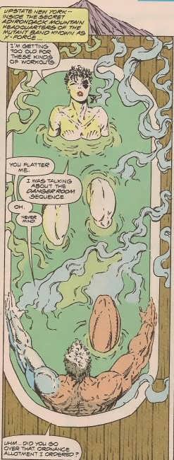
As an strict investigator of art movements thoughout history, Mr. Liefeld translates his genious in these two pannels. Not only is it a homage but a composite outline in deconstruction and reconstruction of Modernism and erotic narrative of final 19th and beginings of 20th Century. All that without leaving the usual pop art schemas usual in superheroe comic books.
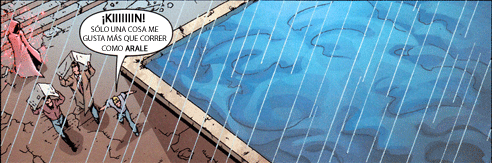
Modernist guidelines are present and deconstructed. From the presentation frame (an awesome stablishing shot where the mountain crowns the bath tub, the interior / exterior shown as an integrated whole) to the scrollwork also very present in modernism (see the affiches in Mucha and Casas, for example), that brilliantly take here the form of a ethereal smoke, vaporous, like an ambiguous gauze that conforms a sensual ambient.
Also, the zenith drawing of the bath tub not only meets the objective of framing the pannel into a narrative time but it also becomes compositive part, integrating itself in this great pannel. The wood surrounds the environment, giving it an organic plasticity while it also pays homage to the images we talked about before.
The main characters in the image operate in a misleading sexual manner, with a sensual view halfway between art and the erotic narative that the author has researched in the making of this pannel. The woman seems to rush into the experience, opening her thighs, while the man receives her with his erect knee in a clear sexual metaphor. What in other scope may be a simple image where two characters relax in a tub, in Liefeld’s hands becomes an erotic game, ambigous, with several layers of meaning.
Mr Liefled plays with the approach, with the deliverate deceit, with the subtle metaphor that manifests his genious.
Progressive Boink’s critism has no substance or fundament. It’s based in personal opinion, pointing the deformity of the characters without going deeper into the authors proposal. I would assume that the same critics in front of a Greco painting would comment: "Oh, those characters are stretched".
The prolific imagination of Rob Liefeld when creating new characters is only comparable to those of great creators like Jack Kirby or Steve Ditko. This is how he was capable of renewing the New Mutants villain rooster with an incredible ease, creating out of nothing a large series of very charismatic villains, so dificult to handle that later authors didn’t have any other option than relegating them to limbo when they saw themselves incapable of reaching Liefeld’s freshness in development of new and attractive characters.
One of them was Forearm, an original villain also in the little game with his name, as his mutation consists in having four arms.
The boys at Progressive Boink say that Forearm has no depth or interest, but everyone knows that an artist is greater by what he shows between the lines than by what he tells directly. We know that a person with four arms is a freak, a deformed, imagine how harsh his childhood must have been, let’s not even consider his adolescence. This kind of marginalization can only lead to joining a mutant terrorist group. Forearm is just a victim of his circunstances, but Liefeld doesn’t explain in detail something that he knows should be clear for his watchfull followers when he can better serve us by focusing on the action.
Also in Progressive Boink they insist in looking for a logic in Forearm’s anatomy. As if people with for superior limbs were common in medicine or biology books. Liefeld represents the deformity in all it’s rawness, transmitting the horror of living trapped in that body so far away from usual beauty cannons. Luckily nowadays Marvel writers have felt pity for Forearm and he has lost his mutation after M Day, giving him the oportunity of living a normal life at last.
Boy can old Rob design a costume! Let’s see, half-jacket, turtleneck, matching dance troupe gloves and oh yes GIGANTIC AREA. Apparently the background artist for this panel was Harold, who was kind enough to lend his magic crayon to the scene. Hey, no feet in this one! Score! Oops, still managed to fuck up Deadpool’s hand pretty bad, though. Oh well, I’m sure too many people will be unable to tear their eyes from that bulging gray package to give a shit. Let’s start by saying that ROB! is, among other things, a Cool Hunter and a trend creator. His risky and innovative designs may scare those that prefer the old spandex look but ROB! has always been unique and managed to give his clothes a unique personal brand.
ROB! in this design conveys that this character is in fashion as he has carefully combines both colours and complements:
On one hand his red blazer (tipical of the time) combines with his gloves and, probably, with his boots. On the other hand, the marks on the jacket in a metalic grey tone is the same as the collar, arms and belt pocket in his leg.
We must admit that the character’s crotch is notably highlighted. But seeing Deadpool’s pose and seeing that he has a "light hand" (pun intended) we prefer to assume it’s just the heat of the moment and not an error of our defended.
We all know that ROB! rules. That he is a fucking genious of the drawing pen is public domain. But what most of the populace may not know is that ROB! is one of the greatest fighters for freedom of speech and censorship in comic books.
ROB!’s ideas have always been clear. You can’t limit art. And the rigid Marvel was not the best place to express freely, that’s the main reason he funded Image (not like that greedy TODD!, we all know he did it exclusively for the dough). In Marvel ROB! wanted to make more adult stories but Bob Harras wouldn’t go with it. Time always puts everyone on it’s place and Bob ended up in Wildstorm, under JIM! Lee’s orders.
But during his ternure in Marvel ROB!, as any other GENIOUS, would still camouflage his art to draw whatever he wanted. And if he felt like drawing bizare sex, he would have it, independent of what his bosses wanted.
A superficial view of the image makes you think that Garrison Kane is a cyborg that has launched his left hand towards Deadpool’s neck. But that is not the case. If there’s something that ROB! masters it’s kinetic lines. Let’s clean the image and see where the hand comes and where is it heading.
There it is. The hand comes from the center top and goes to the center bottom. Think of where this hand has left and where it’s heading. How can a fist come from "there"? Of course. Haven’t you seen Kane’s scrotch? Why should there be any limits in cyborgs design?
Yes, gentlemen. The dialogs may say whatever they want but this pannel shows clearly what the sexual practices between members of the Weapon-X Project are. Cyberfisting, gentlemen. Top this if you can.
(And for those wondering where Kane’s right hand is there is an easy answer: it’s taking a beer with his right foot)
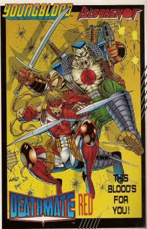
The image that we are sharing tonight is, like any other from this author, a composition prodigy that not always is valued like such by certain bigoted critics. "Why does Rob Liefeld think that guns should have two holes?" argue opponents of Rob!’s work. It’s very simple, smartass. Because it makes MORE sense!
I still remember, years ago, when it was mandatory the use of one rearview mirror in cars. The other one was optional. "Why the hell would anyone want a second one?" was the thought shared by all of us not touched by innovation.
Otto Octavius thought that two arms were not enought, and no one discussed Stan Lee’s mastery over anatomy. Of course he knew that normal people only have two arms. But extraordinary people have the right of choosing as many arms as they feel like.
In fact, unbelievers can now see how USA’s weapon industry has learnt Rob!’s lessons.
They also complaint against the yellow background and the ilumination. Why are these characters confronting their enemy with a yellow background and an intense zenithal light? And it’s here where we find the allegorical that puts Rob! above the average artists. The yellow colour simbolizes in english fear, while in spanish it’s more common to use it as a symbol of bad luck. The critics having underestimated Rob!’s talent only consider (if so) the first meaning while our artist focuses more on it’s second. Rob! is not afraid of bad luck and reminds us that he was brave enought to create his own company. If we counterpose this yellow background with the clear red present in the
clothes of the characters we find a dynamism very infrequent nowadays. It’s easy to enfatize a bright colour over black and white asFrank Miller o Spielberg do. But doing it in the 90s? Boy, that wasn’t easy at all.
Last but not least, we must highlight the wordplay made by using our character’s names.
BloodShoot
DeathMate
YoungBlood
Blood4You
It’s here where Rob! shows his love for literacy. Not everyone would know how to make an alliteration like him. It reminds the refreshness of a fresh drink (blobloblo). It’s a young and vibrant sound to win over youth.
And with that I rinse my tears of admiration and say goodbye for today, friends of Rob!’s work.
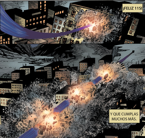
Esta semana sí, no parece que haya apolojetas a la vista y hemos tenido ya una reentré que vale un potosí y nos ha puesto a dar vueltas a la idea de que DC puede lograr en un sólo año lo que Marvel necesitó todos los ’90 para conseguir. Pero no adelantemos más porque ahora
¡VAMOS A REPARTIR PUNTOS!
EDITORIALES
IDW
Que ve abrirse el cielo con la llegada del trailer de la nueva de G.I. Joe (2 puntos)
lo que aporvecha para anunciar que ellos también se ponen al día con ComiXology y sacarán a la vez en papel y digital. (2 puntos)
Han decidido dedicar este año a difundir lo que para ellos es más importante de su "marca", es decir:
No, no, los escritores calvos no. La CREATIVIDAD: Así que cada semana sacarán a un autor, algunos vídeos y las tontadas que se les ocurran. Ardo en deseseos de que llegue la Semana de ROB! (5 puntos)
Mientras tanto, un ejemplo de esa creatividad. Jonathan Ross guionizará con Brian Hitch a los lápices una idea magnífica y recolucionaria:
¿Quién podría argumentar algo en su contra? ¡Creatividad! (2 puntos) Que ya podrían aprender delos noruegos a cargo de la publicidad de The Walking Dead. (2 puntos)
TOTAL = 9 puntos.
Archie
Como Archie tenía pocos problemas ya con sus dos líneas temporales futuras los editores han decidido crfear una tercera en la que se casa con Valerie de los Pussycats. Será por futuros alternativos. (3 puntos) Lo que pasa es que luego llegan los conservadores cristianos y ponen el grito en el cielo, como no tuvieron bronca suficiente con la boda gay resulta que también les molesta eso de las bodas en futuros alternativos porque "enseña a nuestros hijos la poligamia". Vamos, que leer Archie es peligrosísimo (5 puntos de una y 5 puntos de la otra bronca)
TOTAL = 13 puntos.
Ediciones B
Implacable con Mortadelo, ahora sacan un coleccionable en el que Ibáñez ha "seleccionado" lo mejor de sus 40 años entre lo que destaca el cómic conmemorativo del 50 aniversario de los personajes. No, yo tampoco lo tengo claro así que le atizamos 10 puntos por el logro. Más 5 por haber sacado el coleccionable y, pro supuesto 5 más de presencia en prensa.
TOTAL = 20 puntos.
Planeta
Con el nuevo año se pierde la página, son asimilados por la editorial madre y hasta se llevan al Bot. No sé qué más les puede pasar este año pero sí que arrancan con 10 + 10 puntos.
TOTAL = 20 puntos.
ECC
¡Nueva editorial! Y nada mejor para empezar el año que 10 puntos de apertura y otros 10 por haber empezado el año retrasando las colecciones. Entre esto y la divertidísima forma de llevar el asunto preDCNU (5 puntos) tenemos un serio contendiente… el año que viene… (y si siguen aquí)
TOTAL = 25 puntos.
Panini
Me parece que tenemos que aprovecharnos de Oz, Totó. (2×2 puntos) Con eso y los Heroes de la Tele (2×2 puntos) parece que ya tienen algo pero, espera, Valdezeate se ha cambiado de editorial:
¡Crazy Men! Por la genial idea de poner en grande un numero 1 dorado en la portada de sus comics, con la inscripción “1.er número de una nueva era” pero SIN RENUMERAR LA COLECCIÓN. Visto dos veces. (3 + 3 puntos)
¡Crazy Men! Por poner (aparte de en el nombre de la editorial que no es de Stan Lee) el nombre de“El Hombre”, uno de mis autores más puntuadores!, en los autores del cómic, cuando ni guioniza, ni argumenta ni dibuja. Es usar su nombre en vano. Bueno, para vender, pero en vano. (5 puntos)
Así que 2 MVD para él y, como fin de fiesta para Panini el anuncio de que para finales de año se ponen a 3 meses de la distancia de salida USA se lleva puntos, 5 por la idea en sí y la locura que será el acelerón, 3 por hacerlo cuando ECC parece que necesita más tiempo -je- y 10 por hacerlo ¡¡¡EL 28 de DICIEMBRE!!! Unos genios, eso son.
TOTAL = 37 puntos.
Dark Horse
Y creéis que no todo el mundo sufre raras peripecias. A la queja de varios libreros porque sus cómics de 3,50 $ salieran en digital por 2,99 $ han explicado la terrible verdad: En realidad los precios no los marcaban ellos. Aseguran que Apple no permite precios terminados en ",50 $" sólo ",99 $" de manera que como 3,99 $ les parecía mucho decidieron rebajar la edición digital. Los libreros, moscas aún, piden un ajuste para que sea el mismo precio, asi que ya véis cómo Apple puede llegar a liarla. ¡Bravo! (5 + 5 de estilo )
Pero, claro, estamos hablando de una compañía que ha logrado recuperar Nexus (3 puntos) o lograr uno de los crossovers definitivos Conan vs. Groo. (10 puntos)
Y como estban en racha han dejado que Eric Powell le lance una minúscula puyita de nada a la industria en su próximo número de The Goon. (5 + 10 puntos de estilo)
TOTAL = 38 puntos.
Marvel
¿Saben aquel que diu de la acumulación de errores que crea una enorme bola de fango? En Marvel por supuesto, les pasa de vez en cuando, la última
Después de esto (10 puntos) lees la noticia del camello disfrazado de Hulk y tampoco te sorprendes mucho (2 puntos) y es que no salen de una y se meten en otra, aunque sea para saber si los X-Men son humanos o no, en una historia de Guys, Dols, Toys & Action Figures! (5 puntos) Una tremenda decepción, Marvel cambia el nombre y contenido de los especiales de Spidey (3 puntos) aún puede sacar más puntos si ha decidido reducir a la mitad el tomo para sacar dos por el doble de pasta. Con eso y con todo Axel Alonso (Half mexican le llaman) se pasa por Fox News (3 puntos) Menos mal que lo compensan en DareDevil montándonos una portada con un porrón de rayitas, ¡así, SÍ! (3 puntos)
En Marvel sí saben montar un sarao, por ejemplo para anunciar AvX VS, una mini de 6 números que "Expandirá las batallas de Avengers vs. X-Men". ¡Títulos de mamporros sin trama, eso es lo que reclama el mercado! (5 puntos) Pero, ojo, que también quueda un hueco para los jóvenes creadores, por eso han fichado para el último arco de Bendis en los Bendisgadores a un pipiolo: Walter Simonson. (3 puntos)
Que Jill Thompson prepare una colaboración para Mavel nos parece bien, que sea guionizada por CM Punk ya es maravilloso (3 puntos) a ver si hay suerte y la próxima es con dibujos de ROB! Y mientras unos vienen otros se van para que la vida siga igual: Brian Hitch anuncia dos cosas y no sabemos qué es más complicado: Su marcha de Marvel o que haya dejado terminada toda su tarea para Ultron War. Veo a los señores de Marvel cortando y recortando para las improvisaciones de Bendis. (3 puntos)
Pero todos sabemos que lo que nos interesa es, en realidad, el mercha así que, ¿qué podemos ir viendo de la peli de Los Vengadores? (3 puntos) Y más importante aún, ¿algo interesante de Spidey? (5 puntos)
Claro que ahí están las posibilidades de tunear avatares de la X-Box (2 puntos) super monos o hacerse unas máquinas de pinball (3 puntos)
TOTAL = 53 puntos. ESTRELLA DE LA RONDA
DC
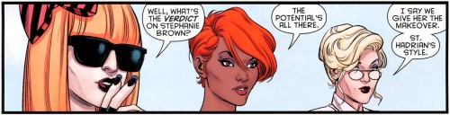
Hay que reconocerles que se están esforzando mucho en ganar esta competición y en tenernos contentos. Qué bonito es poder empezar, gracias a Batman: Leviathan Strikes
! con un clásico, en este caso un Deja vu! al contemplar todas esas caras conocidas rodeando a Stephanie Brown. (2 puntos)
Parece que DC ha decidido ir desvelando secretos y, de entrada, ya sabemos que el nombre real de Carmen Sandiego es Pandora. (2 puntos) Ahora sólo nos queda saber el motivo: ¿Será que le gusta abrir paquetes? ¿Será para diferenciarla del resto de heroinas DC que son sobre todo Pandero? ¿Es algo de Watchmen 2 debido a que sólo la habitan hombres azules de 2 metros? Esperaremos expectantes las siguientes expectoraciones de D C.
DC no quiere decir oficialmente que está preparandao Watchmen 2 -Normal, sólo les fala enfrentarse a Glycon- pero sí que han prohibido, abogados mediante, a Bleeding Cool que publiquen nada más del tema por ser material confidencial. ¡Viva DC! (5 puntos)
En DC saben que tienen que ser consecuentes y lograr un equilibrio entre lo que había antes yt después del DCNU, por eso cuando se ponen a cancelar le toca por un lado a cosas anteriores (10 puntos) y también cancela series de las 52 (6×10 puntos) pero luego sacan nuevas (6×5 puntos) lo que incluye algunas sorpresas, y no me refiero al lanzamiento de G.I. Combat -que parece mentira, DC, que tenéis una edad ya…- tanto como a que hayan convencido para guionizar una serie a China Miéville, que se ve que si algo hacía falta en el DCNU eran más Chinas, y entonces dan un salto porque han fichado a Ian Churchill y, atentos, HOWARD MACKIE! para un spin-off de los Teen Titans (10 puntos) y esto parecerá difícil de superar pero es que lo importante es que han avisado de que ROB! se unirá a TRES SERIES (3×5 puntos x 3 de la Regla de Oro) que demuestran que están a tope.
Todo lo cuál ha conducido a la compañía a mover las cosas con su nuevo logo:
Un logo intuitivo e inteligente que sólo puedo definir como "Yogur" proque trasmite la idea de destapar la editorial para disfrutar de lo que hay detrás o encontrarse con "Siga buscando, hay miles de premios en el interior". (3 puntos + 10 de estilo)
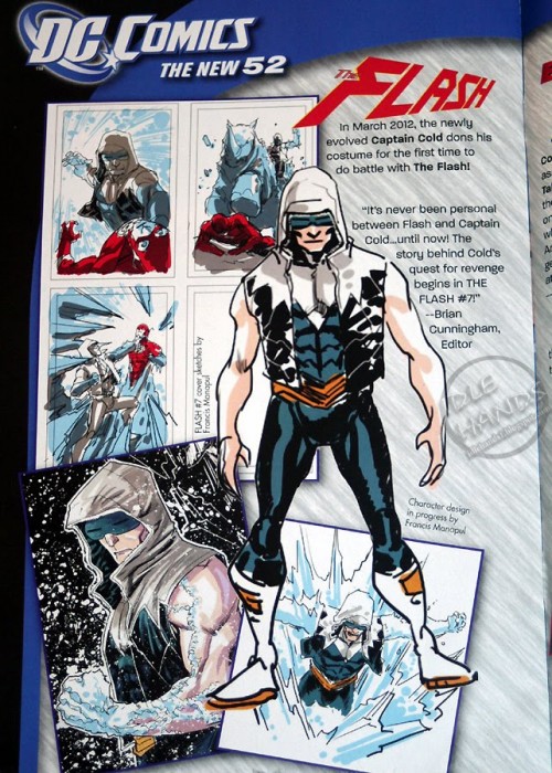
Luego ves rediseños como el del Captain Cold y no mueves ni una ceja. (3 puntos + 5 de estilo)
Cuando la NBC anunció que habían elegido a David E. Kelley para desarrollar una serie sobre Wonder Woman nos preguntamos cuánto tardarían en aparecer los juzgados, cuando tras su piloto fue no-escogida pensamos que nos quedaríamos sin saberlo… pero no. La actual serie del momento de Kelley, que se llama Harry’s Law como se podría llamar L.A. Law, Boston Legal o Ally McBeal (Aunque Kathy Bates llevaría con menos desparpajo la minifalda) ha decidido sacar en un episodio una trama sobre una muchachuela que hace justicia disfrazad de esta guisa:
Sí, ese es el famoso difraz, auqnue no sea la actriz que aquí será Erica Durance, efectivamente la Lois Lane de Smallville. Y luego hablan de trolear. Aprended de él a reciclar ideas argumentales, (5 puntos) Mientras tanto la CW ha tardado poco en pedir un piloto de Arrow, que es como se llamarán las aventuras de Green Arrow para evitar perder al público daltónico. (2 puntos)
Han decidido dedicar este año a difundir lo que para ellos es más importante de su "marca", es decir:
No, no, los escritores calvos no. La CREATIVIDAD: Así que cada semana sacarán a un autor, algunos vídeos y las tontadas que se les ocurran. Ardo en deseseos de que llegue la Semana de ROB! (5 puntos)
Mientras tanto, un ejemplo de esa creatividad. Jonathan Ross guionizará con Brian Hitch a los lápices una idea magnífica y recolucionaria:
¿Quién podría argumentar algo en su contra? ¡Creatividad! (2 puntos) Que ya podrían aprender delos noruegos a cargo de la publicidad de The Walking Dead. (2 puntos)
TOTAL = 209 puntos.
Más 100 como Estrella de la Ronda = 309 puntos. Y como ha dado muestras de GENIALIDAD! sin límetes permitimos que los acumule todos.
AUTORES
Peter David
Cuando PAD se aburre se pone creativo, eso le lleva a, por ejemplo, tratar de interpretar qué clase de persona se autodenomina Mr. Fantástico, su mejor amigo es T
he Thing y su mujer es Invisible. Todo ello sin mencionar a Don Draper. (3 puntos)
TOTAL = 3 puntos
Warren Ellis
Un año más Ellis se une a Octavio Acebes y Rappel para pronosticar como será -bueno, cómo debería ser- el mundo este nuevo año. (3 puntos)
TOTAL = 3 puntos Jim Lee
Se luce diseñando la camiseta del FCBD en una ilustración que sin duda tiene detrás una historia…
… en la que se explica por qué algunos personajes vuelan y todos han perdido su tercera dimensión (3+2)
TOTAL = 5 puntos
Grant Morrison
Si hay un colectivo perjudicado por los autores de cómics es, sin duda, el de sus abuelas. Eso es lo que podría explicar la existencia de una MorrisonCon que girará sobre el (5 puntos) claro que siempre tiene un hueco para hablar de la música que habría que escuchar con sus cómics (2 puntos)
TOTAL = 7 puntos
Mark Millar
El escocés empieza 2012 rebajando las expectativas del Millarworld, vaya, vaya. (3 puntos) Para compensar se ha puesto a promocionar como si no hubiera mañana Supercrooks y lo mismo explica sus opiniones sobre creación de cómics (3 puntos) y la necesidad de ofrecer algo nuevo -así, sin reirse- (2 puntos)
TOTAL = 8 puntos
John Byrne
Cuando llega un nuevo cómic de Byrne esamos dispuestos a creer casi cualquier cosa que se nos cuente sobre él, por ejemplo que se llama Trio. Lo que pasa es que luego llegan los periodistas inshidioshosh y aseguran que en realidad estos angelitos
El inglés que se mete en charcos puede disfrutar ahora de la versión anotada de su Sandman (5+5 puntos) que están publicitando pro todas partes (2 puntos) así que aprovecha para hacer entrevistas en las que habla de casi cualquier otro tema (3 puntos)
TOTAL = 15 puntos.
Stan Lee
Un cumpleaños parece importante, sobre todo si cumples 89 años y sigues sin parar. Ahí está él creando superhéroes para La India (3 puntos) Que para eso se merece hasta documentales sobre su vida. (10 puntos) Así que anticipándose a todos sus fanes que querrían hacerle regalos Stan ha dicho que mejor que eso se haga una donación a Hero Initiative.(3 puntos) Si es que este Stan sí es solidario.
TOTAL = 15 puntos
Alan Moore
Lo bueno de Moore es que no para, así qeu según avance 2012 le veremos hacer más y más cosas, sobre todo si se confirma Watchmen 2 y tiene que ocuparse de lanzar una maldición Maya a DC -o sentarse a esperar que tampoco tiene élmucho que hacerles- en cualquier casono deja de dar entrevistas (2×5 puntos + 4) e incluso de hablar en la radio (5 puntos):
TOTAL = 19 puntos
ESTRELLA DE LA RONDA
Dan Didio
Parece mentira, ser el jefe y que te cancelen la serie… Con lo que tú has sido, Didio. Menos mal que te llevas 10 + 10 puntos para resarcirte por convertirte en el gran damnificado de la Nueva Nueva DC en la vertiente AutoDamnificado. ¡Esto es el hacerse cortes del mundo del cómic!
TOTAL = 20 puntos
Más 100 como Estrella de la Ronda = 120 puntos.
Así que las cosas no han cambiado tanto como parecía, todos compiten. Lástima que nos hayan dejado Joe Simon, Eduardo Barreto, Vicar o Ronald Searle porque ¡No creo que nadise quiera perderse la próxima ronda!
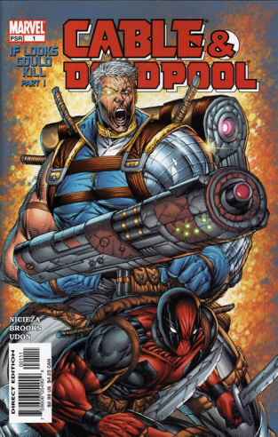
Following the old Marvel tradition, the third comicbook the series that made ROB! the rockstar he is now would include the crossover of the Amazing Spiderman, with who X-Force would confront the terrible Juggernaut, one of the most powerfull mutant foe. How can we represent this menace, the power of a railway engine out of control, in just one image? It is not an easy task and only an artist of Rob Liefeld’s talent could sucessfully accomplish such a feat.
To do so he uses a dynamic composition, to make clear that the Juggernaut is unstopable, a force of nature. Most heroes become mere spectators of this show; the only one standing in his way, Shatterstar is passed over, not even giving him a chance to use his lethal swords. Juggernaut crosses through cover with dynamism. His right arm is used to highlight the comicbook’s title and to emphasize the colossus direction, if you follow it you can also see Cannonball, whose tiny size indicates his remoteness, not even him can reach the Juggernaut.
Also, to prevent the viewer to get distracted from what’s really important, Liefeld leaves out any kind of background or scenery, that get’s reduced to a boulder that serves as a pedestral for the terrible villain. But Liefeld does give us a few clues about the localization of the characters: the presence of the most newyorker of heroes and his pose, hanging from a tall building, reveal that the action takes place in New York. In his pedestral, the dust storm indicates that the Juggernaut’s run is size of a cattle stampede. Also, compositionally, it allows the inclusion of texts without hiding any of the characters.
No doubt this would be a sure buy for anyone who saw this atractive cover in his usual comicbook shop.
It is said by art scholars that the portrait is probably the most dificult task for an artist. Painting a still life or a landscape is reasonably easy, painting an everyday scene or one composed of several characters is something more dificult, but the portrait is the maximum expression for both the portrayed and the author as it equally reflects a lot from both of them. A lot has been written already and will still be written about this portrait:
The Gioconda, of Leonardo da Vinci, also know as the Mona Lisa (no doubt this was the typical nickname given during the Renaissance). In this painting everything has been analyzed, from the use of colours til the time of the day it was painted, but most especially there has been a lot of focus in the enigmatic smile. It’s never been completely certaint who was the portrayed (although the most extended thesis is that she would be Lisa Gerardhini) but it has never being important because a complete study of the painting can tell us everything we would want to know about her.
… Wait a minute… This is a comicbook blog, what are we talking about?
A little patience, I’ll get to the point in a minute.
During an artist’s life he can produce thousands of pages, hundreds of thousands of panels and huge ammounts of characters in all posible postures, and while in lots of panels the character may appear in a close shot or multiple splash pages it’s fairly uncommon to find him in a portrait that equals (if not surpasses) the previous example.
Yes, it’s ROB!
Look carefully at the ilustration and don’t get distracted by the inopportune lettering prevents us from comtemplating the image in all it’s glory. Because this isn’t the typical character reveal that the world of comics has gotten us used to. It’s an ilustration that combines the pictorialand comic book tradition, adapting it to the awesome 90s.
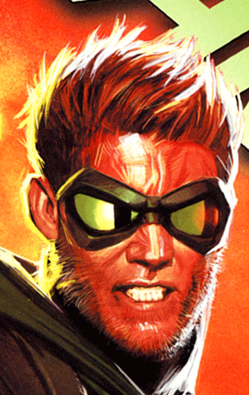
In itself is more of a portrait in the classical term of the word. Liefeld‘s precedents are many other portraits featuring kings, noblemen or even intelectuals that inspire at the same time respect and fear. Focus on the dark face, in how he holds his helmet as if he were a warlord, in his weird pose halfway between upright and relaxed in his throne, well, more like his captain’s chair.
But before we continue let’s put the image in it’s context. We are talking about the closing image of the 100th issue of New Mutants, the comic that evolved through Liefeld’s art. Thanks to Rob the new alumns of Xavier’s School would mature under the leadership of Cable until they even emancipated from the bald guy to start their own X-Force corps. Strife would be one of the vilains to beat during this stage.
The same art schoolars that I mentioned at the begining of this text maybe would not completely understand this image, maybe they would even consider it ordinary or a bad executed portrait. But they don’t know what they are talking about. Liefeld is, over any other thing, a visionary and has updated the art of portraying adapting it to his own style, capturing completely the essence of Strife.
In first place, judging from the use of shadows if the light comes from the left of the character (as we can see from the colour) how do we know his face is darkened? Is it a bad use of lights and shadows? Nothing could be further from the truth. His darkened face reflects Strife’s soul. Liefeld is explaining to us that although he looks the same as Cable, as there are shadows on his face it means he is the bad guy. By the way, notice the detail of the right eye’s shape in the shadow.
In second place we should consider the lines. While some may argue that for a portrait they are not necessary, Liefeld uses them as they are one of his most particular traits. Lines = dynamism, and someone who is dynamic will maintain this characteristic while sitting or running.
In third place I would like to address the point of the open mouth. The brief explaination is that it’s a plot requirement. At that precise instant Strife is talking so it would be entirely justified that he had his mouth open. Nonetheless we all know what perfect teeth mean in ROB!’s methodology only we are not going to talk here about teeth but the mere mouth gesture indicating his authority.
In fourth place let’s focus on the left hand. Look at it it, can you see something weird? Exactly! The index finger is longer than any other one. The anatomic knowledge of our artist has always been doubted, critics talking that he put muscles where there weren’t any, that he didn’t draw any feet, that his knees weren’t realistic. Well, this example here shows an absolut knowledge about body part simbolism, directly inspired by palmistry and eastern iconography. The index finger is a simbol of authority and power, if it’s also long it represents ambition and pride.
My fifth point: the helmet. How does he hold the helmet with his hands in that position? Is it a fault or cunning trick of the artist? As I said before the portrait represents all that Strife is, not only it reflects his appearance but also his interior… and powers. What is Strife? A mutant! And which powers does he have? Among others Telekinesis! That is it! Strife is holding the helmet with his mind, the hands are just pure ornament.
And that’s why there are artists who are limited to sketching a few lines that just capture the physical aspect of the portrayed and then there is ROB! who manages to transmit, through a splash page, the appearance and personality of a villain. No one save ROB! has ever been able to include in a portrait so much simbolism since that multifaceted artist with a Teenage Mutant Ninja Turtle name.
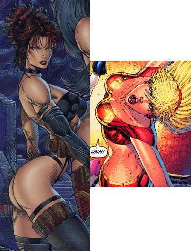
The daring and arrogant thinking entities from Progressive Boink acuse ROB! of not knowing how to draw women, they even suggest this may be as a consequence of not having seen one in his life. Ignorance is always bold
Our ROB! drawing aren’t showing women… Only SuperWomen. They are avatars of a Supreme Femenine Spirit. No heterosexual male (or homosexual female) could ever take their eyes off them. In summary and using words that even them will understand: these women are HOT
But bidimensional art representation has it’s limitations. Even ROB!, the greatest penciller in the last two centuries, feels uncapable of realistically representing the buxom babes that this story requires. Which is the solution that this great narrator finds? Subjetivity
In these images we see women though the eyes of an external observer, and not even him can stand the vision of such goddesses. He is feeling dizzy, he is having hallucinations, his brain can’t retain the image of perfection made flesh. ROB! doesn’t draw deformed women: he draws how the sight of the observer gets deformed by these women
This is something that may have happened to you more than once. Mountain View fills us with subliminal messages, ads that feed our minds and their lust for profit every time you search in their famous engine.
Every new keystroke opens new posibilities, a whole new range of trends that guide our steps, free will is only a mirage. Freedom of choice doesn’t exist.
When a sugestion is repeated a thousand times it becomes an imposition. The influence of these constant micro impacts over our ability to choose is guiding society to a single brainwashed thought.
We trust all our information to a company in exchange for a perception of freedom in our searches. Well, that and free email. Also a neverending repository with publications and videos… And a detailed mapping of the whole globe. And blogs. And… But let’s not get sidetracked, they are the ones making a fortune. This makes us realize the inmense value and influence of the shown results that we didn’t even ask for. Well versed minds call this "Attention Economy".
We mustn’t underestimate the impact of these small viewings have in our subconscious. We are continually bombed by these messages. And we end up following them.
And sometimes what we find fits what we were looking for.
Until it reaches a point in which you can’t deny the manipulation.
Seven simple keystrokes in the most popular webpage in the world reveal a shocking message, a cruel joke that attacks the most basic human dignity. That’s why all of us that have sometime looked for information related with our favorite author have ended up visiting The 40 Worst Rob Liefeld Drawings.
In this webpage we find out that some guys called Hanstock and B have dedicated their time to the useless task of tracing ROB!‘s graphic work looking for any image that they can use for a joke. And because ROB! is generous they have succeded in twisting the greatness of his work with a sickening analysis in a series of texts that only shows their disgusting jelousy.
Think this for a minute. Adult men that invest their time and efford in the ridiculous task of defending the indefendable. Isn’t it sick?
But the important question is: are we going to allow it?
And the obvious answer is NO.
That is why our Organization asked the most illustrious minds of internet to join us in the preparation of a counter attack, using lucid, clear and inteligent defense texts that reply to each and every stupid argument found in that webpage. To show them again that the pen is always stronger than the sword (even if it’s Conan’s).
As I was saying we contacted with the best the internet has to offer, but after many months without an answer we finally had to do the job ourselves.
And this is why, dear disciples, that from this day we start what will be a series of 40 reference texts to do justice. Every sunday (as sunday is the day of our LÖRD!) you will be given a Defense to the offensive words from those kids of Progressive Boing. Even if it arrives too late every action has a reaction.
We start soon, very soon, be ready.
(Ok, to tell you the truth we already wrote and published these texts during the last two years, although its difusion was limited, due to language issues, to the Spaniard community. It had a great success and feedback -maybe we are lying, but you can not prove it, this is why we love Internet- and we were asked millions thousand of times to translate it to English to show the normal world our love for ROB!s work. ADLO means Association for the Defense of Liefeldand Others, and we have been invading people’s mind since 1999 to show the real way comics books must be done. Because if you learn to enjoy ROB!Liefeld, you will be able to enjoy almost everything, everybody will be happier and our passing in this plane of existence will be more comfortable. Or maybe it is just for laughs and we are only a lot of people with a lot of free time, you choose. In any case, we have put our heart and effort to show you that there is other way for analyzing and loving comics. Every Sunday we will be here for you to present a new defense, we hope you enjoy it at least in the same way we did it creating them and Xum making translations of our bad and ununderstanable Spanish to Lobdell’s language)
Una nueva semana con una docena de novedades para comentar. Pero antes:
La lectura del siguiente post que tan cláramente habla de tebeos que NO se han publicado en España hace que cualquier que entre en los comments para quejarse de ESPOILERS será llamado inmediátamente CENUTRIO. ¿Os ha quedado clarito?
Action Comics
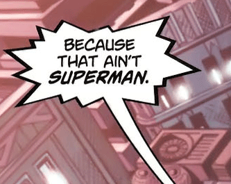
Este es un tebeo complejo, al principio descubres que Superman en realidad no es él, de hecho TE LO DICE , a ver, ¿por qué está mal esta imagen?
Pues ya lo está diciendo el tipo de la camiseta de Zara:
Mira, si lo tiene asumido que no lo es por lo menos eso que tenemos adelantado. Pero si no eres Superman, ¿quién eres entonces?
Ah, vale, Rambo. Y yo que pensaba que eras Batman. O el Correcaminos. Quizá incluso el Spirit. Pero por lo menos mantienes lo de Superman No Mata, ¿verdad?
Hummm… quizá ese señor está ahí echándose la siesta, un edificio moderno con un reposabarrigas en mitad de la pared, sí… Pero a lo que íbamos, pronto aparecen los malos que son:
¡Ortega y Pacheco! digo… ¡Lex y un secuaz! Ambos afectados por su maldad en los ojos, y no son los únicos.
Si es que hay malvados por todas partes incluso cerca de Clark…
¡¡¡Cuidado, ese Travesti puede ser amigo de Lex!!! ¿Y quién es ese tipo al que decís que se parece? Si yo no veo ninguna conexión…
… pero ninguna. Grant Morrison ha hecho un tebeo respetuoso con el personaje, original, interesante y en absoluto realizado con retales perdidos de cosas. Pffff….
Animal Man
Gran ejemplo de cómic poco GENIAL!, por suerte tiene la contrapartida de que ha tenido que llamar a Grant Morrison para darle las gracias por el dinero.
Jailai: Animal Man se ha leido también todos los números del relanzamiento.
Bonus: Búsca las figuras perdidas en la cara y manos de Animal Man, ¿Encuentras una jirafa?
Batgirl
Saben lo que nos gusta en ADLO! por eso no sólo se limitan a reescribir la puntita sino que, además nos regalan unos cuantos de esos momentos propios de la Batfamilia.
Efectivamente, un cómic tan noventero no lo encontraréis con facilidad, ni con un diseño tan…
simplemente GENIAL!
Batwing
En el mismo borde en el que la GENIALIDAD! se pelea con la pereza, esta obra llena de fondos en blanco y que tiene un guión minimalista está lleno de pequeños hallazgos, de ideas orginales…
En resumen, uno de los títulos que nuestra desorganización tendrá que seguir más de cerca mientras decidan que no ha durado los números suficientes y nos sigan regalando viñetas como esta:
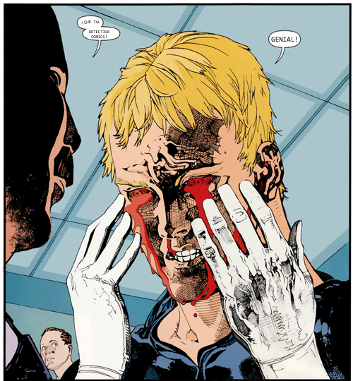
Detective Comics
¿Qué hay más digno de Defensa para ADLO! que los cómics de Tony Daniels, ese genio del homenaje?
Cualquier cosa que dijéramos, y varias de las que nos calláramos, no podrían justificar su grandeza, menos en este reducido espacio, así que creednos cuando decimos que viñetas como esta…
Están lejos de la GENIALIDAD! de esta serie, ay, esa viñeta final…
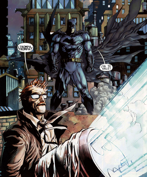
Green Arrow
Una de las que entiendieron que había que traer algo nuevo, de manera que nos propone…
un nuevo Green Arrow, el Green Arrow Lemming:
Quitando lo cuál volvemos a tener una de esas obras noventeras que tanto nos gustan, y que demuestran que si falta algo clásico siempre se puede buscar una original sustitución:
Hawk and Dove
Todos en pie. ¡TODOS! La grandeza de ROB! logra incluso salvar este insulso cómic de supervillanos con planes extraños y pequeñas metáforas subliminales:
Sólo él puede mover y deformar para dar ide de la problemática oculta:
Y gracias a su magnífica forma de crear y planificar la página tenemos momentos memorables
Que nos dan motivos para seguir la serie, más allá de su aburrido guión. Es ROB! en estado puro.
¡¡¡AVIV BÖR!!!
JLI
La idea de darle a Jurgen la serie para hacer una noventata no era mala del todo, el problema es que parecen los guiones eliminados de la última vez que estuvo, y por más que trata de hacerse metareferencial y actual…
uno no deja de tener la sensación de que ya ha visto antes estos… homenajes.
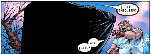
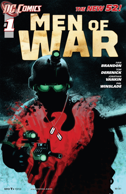
Men of War
Hacer una serie bélica en DC podía tener sus problemas pero por suerte saben cómo tomar el pulso gracias a una aproximación sutil.
pero sutil, sutil.
Y a una idea bien resuelta, vamos a ponerle a la guerra lo que le hace falta:
¡¡¡Superhombres!!! Y claro, a partir de ahí todo va como la seda:
Si, además, le metes un complemento que comparte en gusto por los fondos elaborados con Batwing
logras otra GENIALIDAD! a la que estar atento.
OMAC
Una serie guionizada por Didio y dibujada por Giffen, esto promete, sobre todo porque Didio parece que en los setenta todo estaba más claro, todo es mejor con una referente claro que nos deje claro de dónde sale OMAC:
Y si bien no tenemos -aún- una viñeta de ojo de las buenas buenas hay que reconocerle a Giffen que sabe ofrecerle a la gente lo que quiere.
Por lo menos lo que buscamos nosotros en ADLO!
Static Shock
Esto, que tuvo serie de televisión y todo, es una incógnita: ¿Cuándo transcurre, dónde, por qué? ¿Es todo un sueño de Resines lo que justifica este tipo de viñetas?
Sí sabemos que trata de presentarnos a unos personajes ricos, variados y con muchos matices
y de adaptarse al universo DC como uno más, con gran clasicismo, intentando llevarse los premios por hacer antes que nadie lo que todos esperábamos:
Stormwatch
Poco podemos opinar de ellos, porque tratan de seguir siendo guays y todas esas cosas pero no les acaba de salir, se quedan en una rutina que ADLO! no esperaba, teniendo al Marciano CazaHombres ahí… Y es que esa sensación de mínimos es grande en este cómic que parece sentirse cómodo en su originalidad
A ver si mejora, para bien o para GENIAL!
Swamp Thing
Si Animal Man tiene que llamar a Morrison el Swamp Thing tiene que ponerse en plan webcam guarrona con Alan Moore de tanto que le debe agradecer. La única duda es saber cuánto tardará en llegar el memorandum sobre el aspecto blogguero de Clark Kent
Porque el de Superman ya lo recibieron.
Pero llegamos al momento más importante de la lectura de estos cómics:
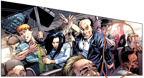
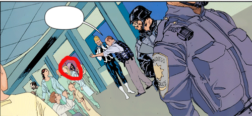
¿DÓNDE SE ESCONDE CARMEN SANDIEGO?
Venga, os pongo las viñetas.
¿Qué? ¿La habéis visto? ¿No? Tranquilos, ¡aquí está la solución!
¡Que divertido y entretenido es el Nuevo Universo DC! Y como diría el proctólogo: ¡No os perdáis próximas exploraciones!